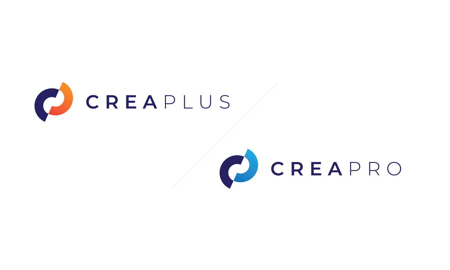
CREAPLUS and CREAPRO are leading Slovenian companies for the development of the highest level of Cybersecurity, operating on the local and international market. The client approached us with the desire to develop an integrated image for sister companies. An image that will reflect modernity, strength and confidence.

The task
Target group: IT professionals, future employees
During the development of the Corporate Identity of CREAPLUS and CREAPRO, we first changed the company's existing colors and kept the orange color of the CREPLUS company, while at the CREAPRO company we replaced the existing green color with a blue color, which is more suitable for addressing the business target group.
With modern typography, we achieved the modernity of the company with increased spacing between letters, and with thicker typography, we achieved a strong standing sign that reflects a solid and well-established company.
The symbol, which is a simplification of the letters C and P, we have achieved a balanced sign that, together with the basic blue-purple color, connects the two sister companies into a whole.

Corporate Identity
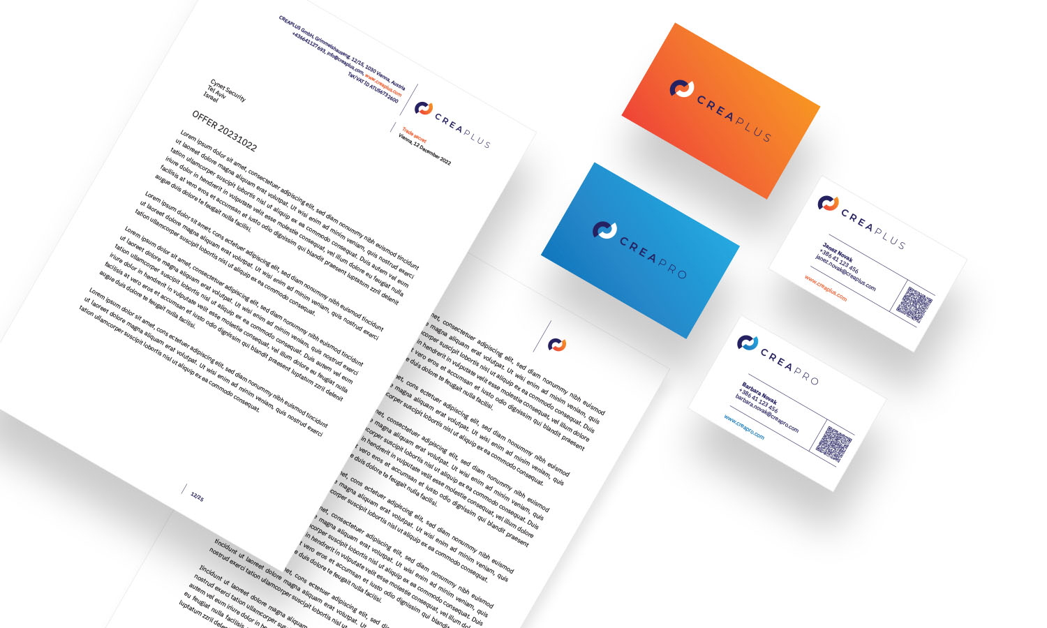
Even through the development of the image of business publications, we wanted to maintain the connection between the sister companies. But at the same time, using colors to stand out from the classic framework of business publications.
Mathematical, architectural, linear design indicates a balanced, pragmatic and rational company that has an extraordinary professional attitude towards its work.

Continuation
We arranged the continuation of the contents, from printed materials, e-signatures, and the website all the way to the arrangement of the premises, on the basis of the Corporate Identity that we designed.
You have more questions?
Give us a call or send us a message